Master Bedroom Transformation Before and After | WEEK 4 FINALE!
I have been sharing my journey in this 4 part series of an exciting master bedroom transformation before and after. And we have finally made it to the after! Of course, the video is much more exciting than just flipping through the photos, so why not click play below and settle in for a show! I also have all 4 of the series in a playlist that I will link right here, in case you want to start from the beginning and work your way through the exciting journey! In the first week of this journey, I share my inspiration board and the ideas I had for redecorating my master bedroom. In week 2, you got to join in on all the shopping fun and finding new items to decorate my master bedroom. Week 3 was a sneak peek at the room as it was coming together. And here is the grand finale!
// watch the whole master bedroom makeover series!
If you’re new to Artsy Cupcake, welcome! I’m Maria and I’m a full time graphic designer, and I love sharing my creative inspiration with you, so we can make life the most creative it can be. I share fashion look books, home DIY’s, delicious recipes and a lot more!
// the before
Let’s remember back to the very beginning of this master bedroom transformation before and after series. My goal was to not spend too much money, yet make a big impact to the overall look and feel of the room. I had a blank canvas to work with. We had basically moved in, set the furniture in place and other than that, there wasn’t much personalization or mood to the room.
The room came with elegant touches built it, like the coffered ceilings, curved wall of windows and high ceilings. Lots of natural light comes into the room. And since this is a new home we recently purchased, the paint, molding and carpet are already done to my taste. The furniture fit the room well and has nice details on it, echoing classical Greek and Roman architecture.
My inspiration board ended up basically being a bunch of Restoration Hardware photos. I just really like the look they have with the classic clean lines, yet they still are elegant in a modern way. The neutral color palette appeals to me because that is how the rest of my home is decorated and I find the colors soothing and relaxing. These photos remind me of a high end luxury hotel room and that is exactly how I wanted my bedroom to feel every night of the week.
So, let’s look a little at the details that made this happen and then you can see the comparison of the before and after of the whole room.
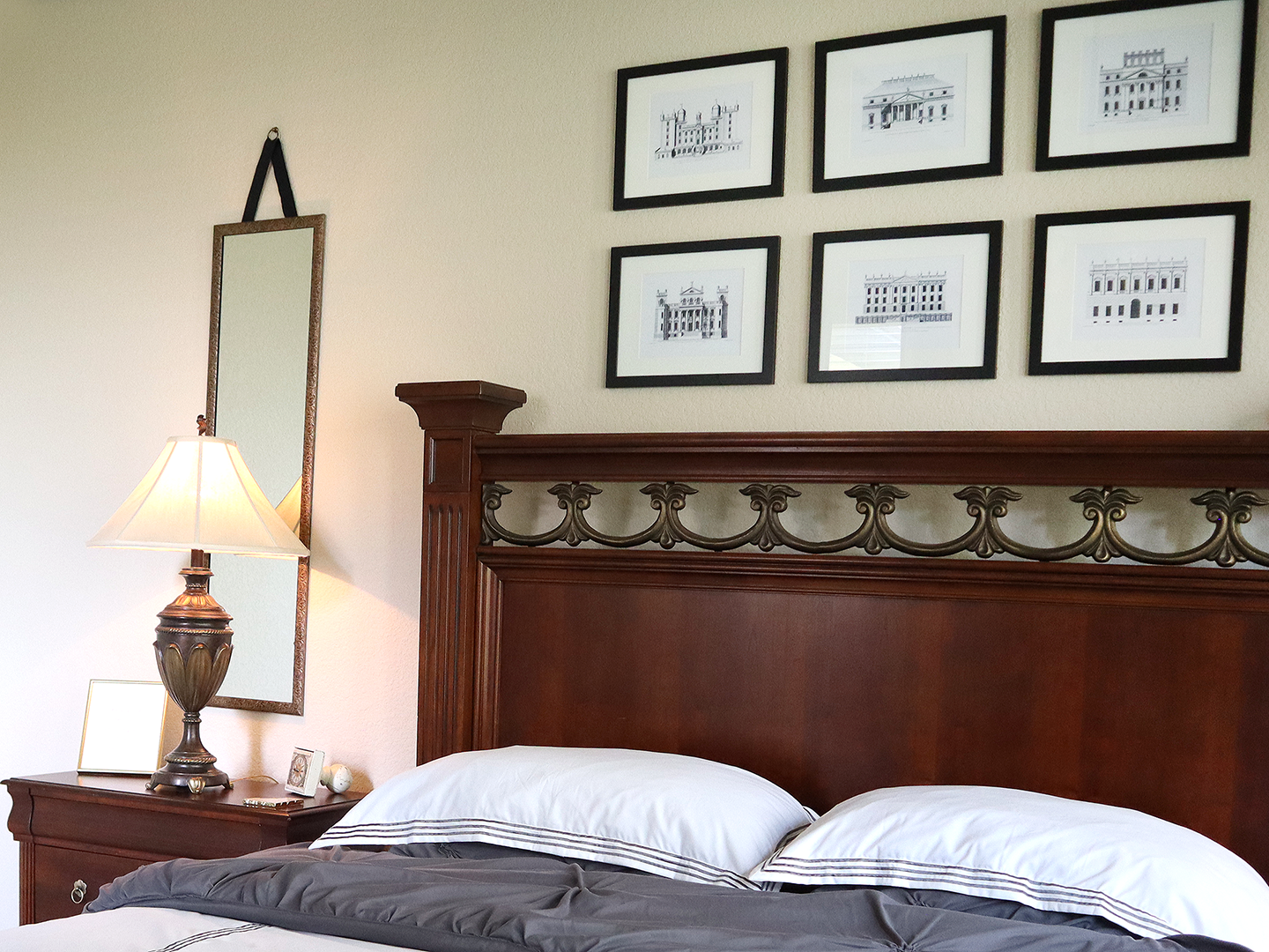
I felt that since the room has the architectural touches on the furniture, and I want it to feel like a getaway in a luxury hotel, why not combine those ideas into the artwork. These series are copies of similar ones I found on Restoration Hardware, which were really expensive. I found great bargains on the frames at Michael’s and Home Goods. I was really happy with these architectural images because they have a classic elegance which is what I was going for. Since I DIY’d these in the third week of this series, they came out exactly like I wanted for a fraction of the price of the ones from Restoration Hardware. I did add some other decor items to the top of the armoire which was so bare and boring! I found the horse at Home Hood for $39. They had a smaller version for $29, but I wanted it to cover the picture a little to add some layers and dimension to this wall.
You saw me buy this suitcase from Home Hoods in week 2 of this series. I got it for $29 and it does double as storage. I think this adds an extra touch to that getaway to a faraway place feel we’re going for. I have it here next to the lamp, so this little corner is pretty simple but that’s ok because we have a lot going on in other parts of the room. White space is important in print and web design, but that white space concept can also translate well in 3 dimensional design projects as well. So when you’re redecorating a room, always make sure there is a nice balance of white space to the decor.
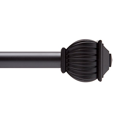
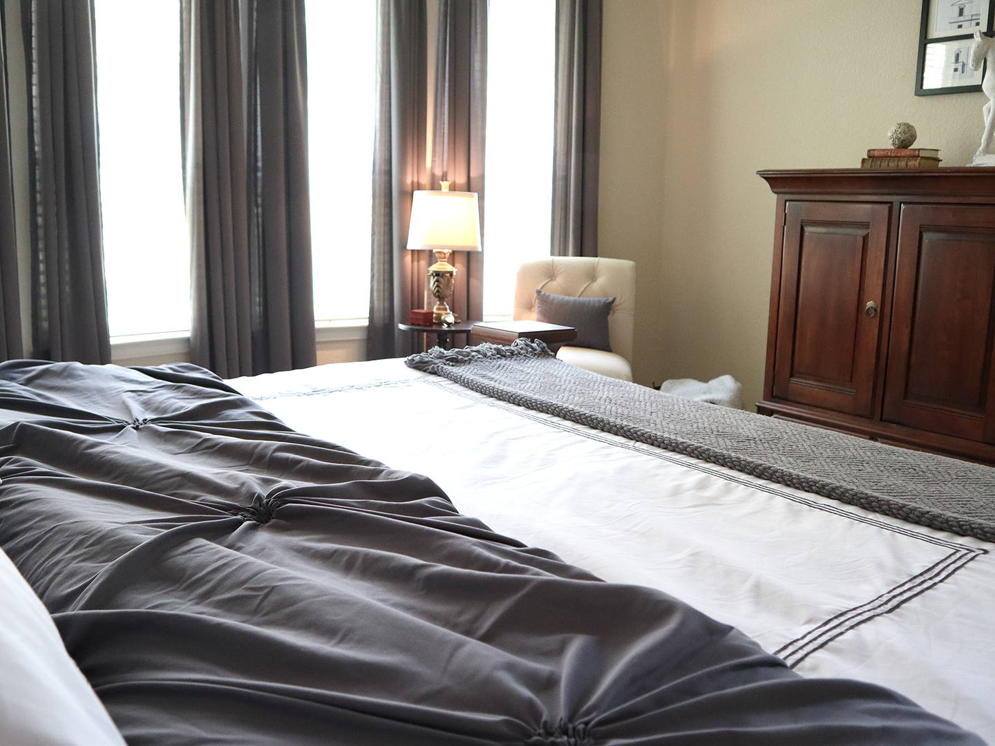
I had noticed a lot of the photos on my inspiration board had the grey curtains and although it felt like a bold move at the time going with dark grey against such a light colored wall, it really works! It was also a hard decision on the rods for the curtains because there were so many ways to do them on the wall of curved windows. I wondered should I get a custom curved rod…but that would be really expensive. And then there was the thought to do just one panel on either side of the entire wall of curtains, but I thought that wouldn’t make as much of an impact. I went with individual rods and curtains for each individual window. I found the rods on Amazon and they are super cheap, but look and feel sturdy and have nice details that go with the rest of the room. The curtains were also really low cost from Amazon, but they were a little lightweight and flowy, so I weighed down the bottoms to give them a sturdier look.
Next is the sitting area. There was a large leather chair on the other side of the bedroom and it just looked clunky. So, I found this chair at Target and put a pillow on it that I already had and this side table and lamp I already had too. I had picked up the basket at Home Goods and put some blankets in there.
The bedding was worrying me! I had ordered one from Overstock, but it never showed up! I spent an hour trying to track it down but the shipping company couldn’t locate it. So, I ordered this one on Amazon Prime and it showed up the next day! It was actually cheaper than the one I had originally bought on Overstock, so that was a win. I played around with how the bed should be made to make it look like a luxury hotel room and I think I got it down pretty good. Bright crisp white bedding is the standard for high end hotels, so I copied that concept at a very low price. I got this duvet set for only $64. I have a lot of off white, greys and blacks, so I wanted the bed to add that pop of brightness to the room and I think this duvet set accomplishes that. I used the old grey comforter under the white duvet and the quality is good; you can see this still looks bright white, so there is no show-through.
The inspiration photos I was working from had mirrors behind the lamps on the nightstands on either side of the bed. I liked this idea because I thought it would reflect some of the light from the windows and also would make the room look a little bigger, as mirrors always seem to have that affect. I think they accomplished that and these mirrors were ones I had found at Walmart for only $13 each! I actually painted them to have a slightly more gold tint to them because they were looking a little silver, but it took 10 minutes and then we hung them up.
After seeing them on the wall, they looked a little plain, so my husband had the idea to add the ribbon and hook to the top. We tried it out and since these hooks and ribbons are just for show and aren’t actually supporting the weight of the frame, it was super easy to pop them on the wall.
// the after
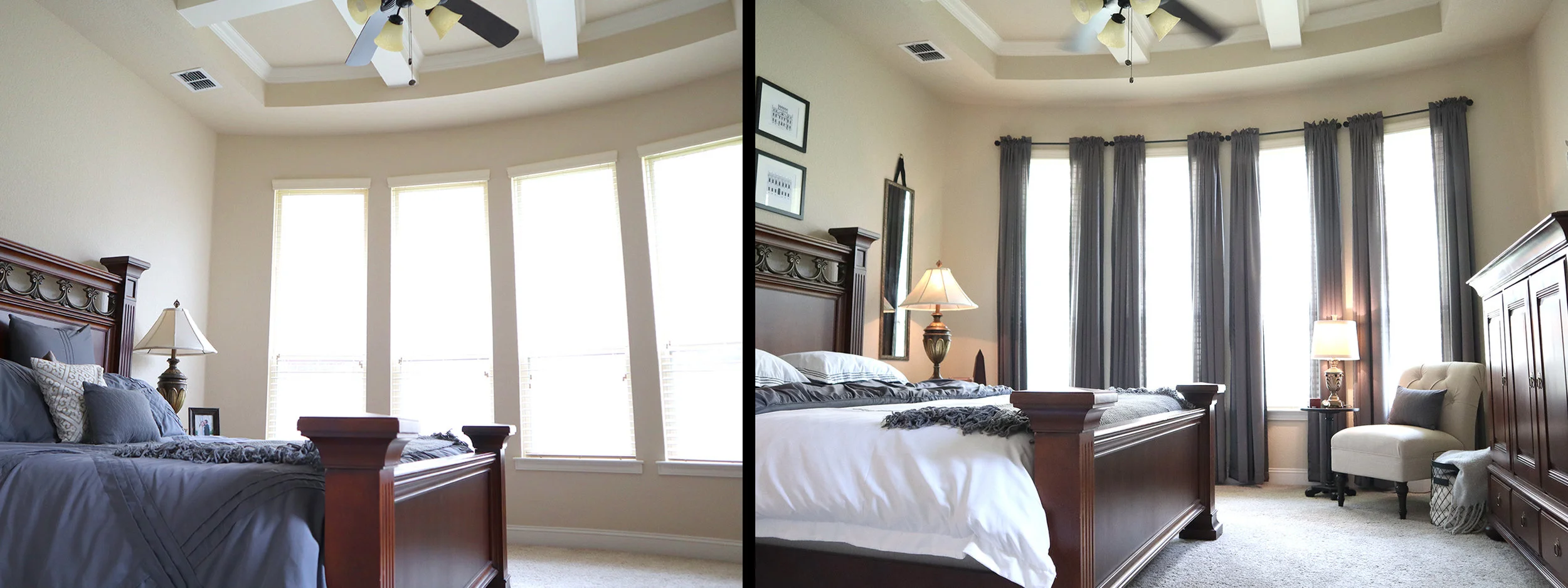
So here it is, it’s reveal time. Take a look at this amazing before and after!
I am so happy with how it came out! It pulls together everything I loved on my inspiration board, it has a classic elegance and feels like a luxury hotel room. The color palette is soothing, yet bright and crisp and I am definitely going to feel like I am on vacation every time I enter this room!
If you liked this series, let me know in the comments below because if i get enough good feedback, I might take you on another journey with one of my other rooms. I’m trying to decide what to tackle next. Thank you so much for watching and I hope you have a very happy day!
// watch the whole master bedroom makeover series!
FTC Disclaimer: All opinions are always 100% honest and my own. Some links may be affiliate. It doesn’t cost you anything extra and you are free to use the link or not as you choose. If you do use my links, I appreciate your support.











How about some Target Dollar Spot crafts and Dollar Tree coastal transformations. We’ll be putting together tiered tray miniatures to decorate our little coastal vignette.