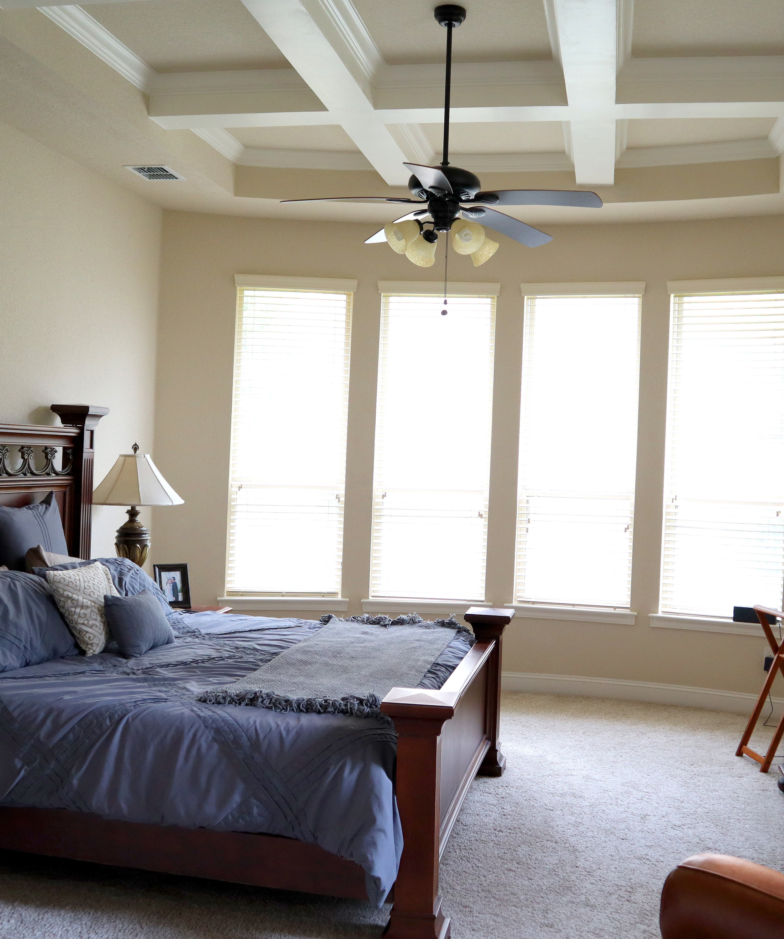
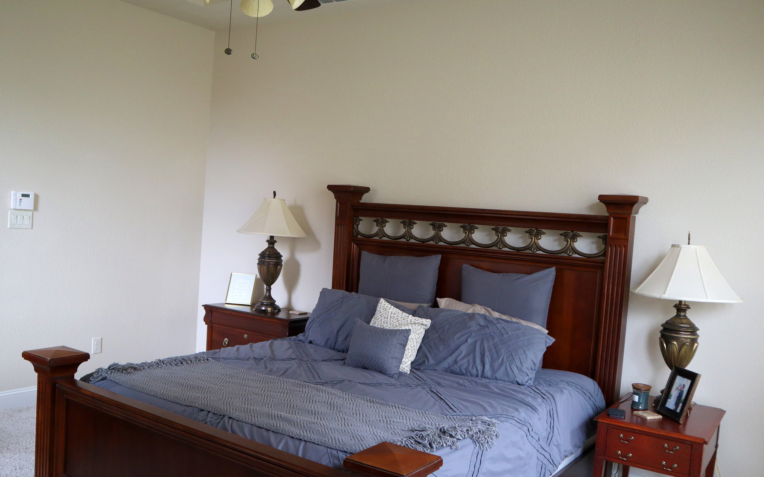
Master Bedroom Transformation Before and After | WEEK 1
I am going to show you how to give your room a makeover. A HUGE makeover. This 4 part series is an exciting master bedroom transformation before and after. Follow along as I update you each week in the month of June so you can see this amazing master bedroom transformation before and after. If you would rather watch than read, you can check out my bedroom makeover YouTube video!
The room is now done! Make sure to check out the full playlist of this series here!
// master bedroom makeover series
In week 1 of redecorating my bedroom master, I will share my master bedroom as it is now and give you a peek at my inspiration board and the ideas I have for redecorating the whole master bedroom. Week 2 you will get to join in on all the shopping fun and finding new items to decorate my master bedroom. Week 3 you will get a sneak peek at the room as it’s coming together. And then week 4 will be the big exciting reveal. Make sure to subscribe to my YouTube channel HERE, so you don’t miss out on any of the videos in this series.
// The project
We moved into a new home about 2 years ago and I can’t believe it has been that long! We put off decorating the master bedroom because it didn’t seem as important since it isn’t somewhere that anyone sees when they come over, so we focused on decorating other parts of the house first.
Another reason we put it off is because, architecturally, the room by itself is already very pretty, so it didn’t feel like we needed to immediately dress it up that much more. The room has a curved set of windows, lots of light, coffered ceilings, and an upgraded ceiling fan. This is a new home, so there is not any painting or molding that needs to be added or changed. The furniture is in good condition and fits the room nicely.
But we are starting with a blank canvas. Since we moved in, basically all we have done is set the furniture in place, have not put anything on the walls, and have some boring bedding. The goal here is to make this look and feel like a luxury hotel room. We want it to feel like we are on a really nice vacation every time we walk into this bedroom.
// Inspiration board
Every good redecorating project should start with a mood board. So, let me show you what I have in mind by sharing my inspiration.
What I’m going for is kind of that look that Restoration Hardware has going on right now. And you will find similar looks like this in trendy, recently updated hotels. I took a look at all of the photos I liked and tried to find what appealed to me and what was similar in all of them. They all have that soothing neutral color palette. Then I noticed was the bedding. It all looks full and luxurious and white is typically the standard in hotel rooms. White bedding gives a crisp, clean and inviting look. But the white or slightly off-white bedding is accented with shades of grey. These light colors work really well with the dark woods and since I am not going to change my dark wood furniture, this works out for me and will save major money not having to redo any of the furniture. It’s always good to use what you have to help the budget not get too crazy!
One piece of furniture I may end up adding is possibly a chair, because I did notice all these rooms have some sort of soft sitting chair or a designated sitting area. I have a leather chair in the bedroom, but want to play around with the curved window space because that looks like it could work better as a sitting area. I may try the leather chair over there and if it looks too clunky, maybe add a smaller softer chair to that side of the room.
Let’s move on to the walls. I noticed on the wall behind the bed these inspiration photos have a series of wall hangings. Several frames repeated in a geometric pattern on the wall really look elegant. They look like these paintings or drawings are all done in neutral colors and have gold beige or black frames and white mats.
Another thing I liked on the walls are the way they decorated behind the lamps. They either put a series of pictures behind each lamp or have a large mirror behind each lamp. I really like this idea, especially the mirrors, because that could make the room look bigger. The lampshades in these examples seem to be really simple with clean lines. I like the lamps I have and think they already go well with this new look, so I can save some money there!
Ok, after looking at this inspiration board I am REALLY excited to get to the fun part – shopping for new items! I don’t have a specific budget in mind. I just want to bargain hunt and find everything as cheap as I possibly can. I will bring you along on this journey, because it should be a fun one!
Don’t forget to subscribe to my YouTube channel HERE, so you don’t miss out on any of the videos in this series.
The room is now done! Make sure to check out the full playlist of this series here!


Today we’re going to shop your own closet for Valentines Day outfits. I’m going to use items you may already have in your closet, so you don’t have to go buy something new for the special day.